I ran a few errands to help clear my head. I checked my internet things to do the same, and here I am. I think it's time for a quick lesson in color theory.
If you stop and think about it, color means a lot in our world. It starts at birth: pink is for girls, blue is for boys. Red stands for passion, and for romance, and for stop. Blue skies are good, but feeling blue is bad. Part of that is because of observable phenomena, like blushing when you see your true love. But the power of color over us has to do with the way we are built to survive. The good things in life like healthy plants, fruit, birds (another source of food) are often brightly colored. Rocks, soil, and storm clouds are more dull or muted colors. True, there are many exceptions to these rules, but it is not hard to believe that seeing in color helped us survive. Thus color carries a great weight with us today.
But how can a person manipulate it to get a desired effect? Perhaps the most important rule is that complementary colors pop. Take a look at this color wheel.

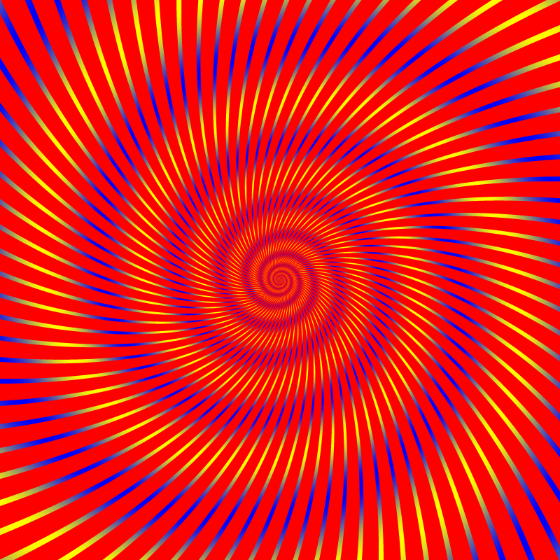
In the center are the three primary colors. You mix these to get all the others. Just outside that are the secondary colors - made from mixing two of the primaries. Here, you get a basic sense of the spectrum. Analogous colors are found next to each other on the color wheel. Red and orange are analogous, for instance. Complementary colors are across from each other on the wheel. These, when placed side by side, can do some really interesting things. Generally speaking, they are opposites, they create a lot of activity inside the cells of our eyes, and always work well together. Now, consider this: If you put two complementary colors which are the same value (equally light or dark), they scintillate. Generally speaking, it works best with really bright or saturated colors, and it kind of hurts. Observe:
Ok, sorry I had to do that to you. But you see how it kind of bugs you? That's great, if that's what you're going for. If not, all you have to do is make one color dark, and the other light, and that annoying buzz behind your eyes goes away.
Another fun thing that happens is called simultaneous contrast. This means if you put one color, say blue-grey, next to red, and next to yellow, it will look different. In the following example, the central rectangles are the same color in each column, believe it or not. Do you see how some of the rectangles appear darker or a slightly different color than their partner?
 Think of what you could do knowing this trick! I use it in my makeup. I have a touch of green in my eyes, so I wear purple or pink eye makeup. These are close to red, which is green's complement. So pick the color you want to bring out. Move across the color wheel, and you can use that color, or its analogous colors to activate the color of your choosing.
 If you want to mute a color, you mix it with its complement. Say I have a bright green paint I'd like to tone down. Add just a touch of red, and you'll make olive. Be careful with this last bit though. You'll make many a puddle of grey muck mastering this skill. Keep in mind that brown is a dark orange or sometimes yellow. Blue is very pretty with brown! Shadows are always a muted version of the color you see. So if you add blue to a brown color, you'll get beautiful shadows. It was a lesson my art teacher taught me in 7th grade, and I use it to this day!
Alright class, any questions?
I didn't think so. You're all so very bright.
A+ for everyone!
Well done! I appreciate the tips! I still don't know how to choose a proper color layout for a website though. Maybe I'll just ask you to look at an HTML color table and pick me out some tones :-)
ReplyDeleteHaha, I'd be glad to help out!
ReplyDelete