For our living room, we have decided, finally to go back to our original thought: grey. Our first greys were very cold, and blue. In a low-light, partially below-ground room, this was not nice. It felt cold, unwelcoming. That's not how I want my TV room! I want it to be warm and inviting, where me, Rachel, and our guests can curl up under blankets and enjoy our evening's entertainment. We tried a whole host of colors (a very yellow-green, orange, red, fuscia, gold), none of which were we willing to live with. I really wanted to avoid a netural, but the color we picked still manages to be sophisticated, and not feel neutral. I am pleased to introduce to you our palette:
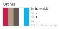
We fell in love with this bright, vibrant blue some time ago, and decided to use it to tie the whole house together. We also talked about using flowers as inspiration. The fuschia/red is from an orchid. We have a soft spot for those. It's also great for warming up the room. The blue and white alone would bring the stone back into cool ranges, which we want to avoid.
Rachel also helped me pick out the accent color for my corset.


The ribbon company calls it "tornado blue." Weird. Wrights calls the bias tape "mediterranean blue." Much more logical. It looks very peacock blue/green, to me. Does this call for peacock embroidered embellishments on my corset? Absolutely!
No comments:
Post a Comment